
Fintech para millenials
Create the branding for a new bank aimed at young people that will only offer mobile and online services.
Deadline
8 hours
Rol
UX / UI
Categories
Research
Branding
Design
Challenge
Briefing
This entity aims to be an alternative to traditional banking that has offices, commissions and complex procedures.
It wants to be a close, creative and modern bank that improves the experience of its clients in the Fintech sector, therefore, it must have a clean and current design, adapted to new technologies and that breaks all the barriers seen so far.
Target
Millennials, people born between 1981–1996.
Goal
First of all, you had to design a creative and usable solution for the Android App dashboard in which the following links would appear:
- Status of my finances / Balance
- Accounts: Show my accounts and the balance of each of them
- Cards (debit, credit, etc.)
- What do I spend my money on?
- Categories of my expenses
- My contracted loan
Second, a navigation flow had to be created to cover the process of making a bank transfer through the App.
It was also necessary to make complex data such as financial ones seem friendly and have a clean and current design.
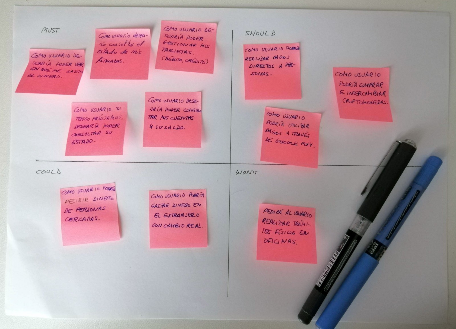
research: techniques used
As I had only eight hours to develop both the research part and the visual layer, I decided to include the following techniques to support the research phase:
Desk research
Benchmarking
MoSCoW
Naming
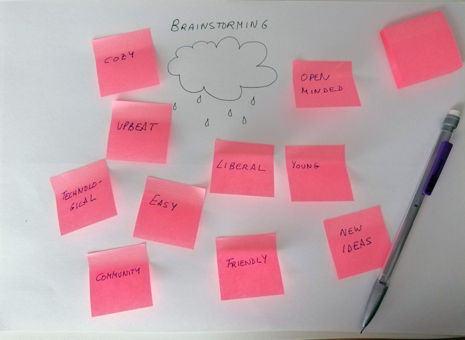
In order to find a solution to the naming issue, I resorted to brainstorming, brainstorming ideas that are launched when the challenge is already defined.
I did a search for positive terms that defined the millennial generation and of all the ones I found, I kept the ones that gave me the most optimism, freshness and sound the best to include as the name and leitmotif of the project. It had to be in English so that the audience was wider.
Express style guide
Logically, in so few hours it is impossible to define a coherent graphic line, with brand name, logo, colors, typography, etc. But hey, in such a short time at least I managed to give the visual layer a bit of shape.
Logo
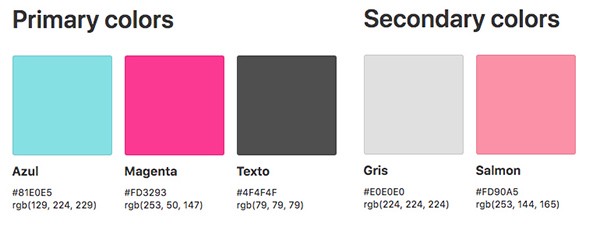
I designed a very simple and easily recognizable logo. The graph with the up arrow conveyed optimism and was related to the term finance, in turn had a positive touch with the UP syllable highlighted with corporate magenta.
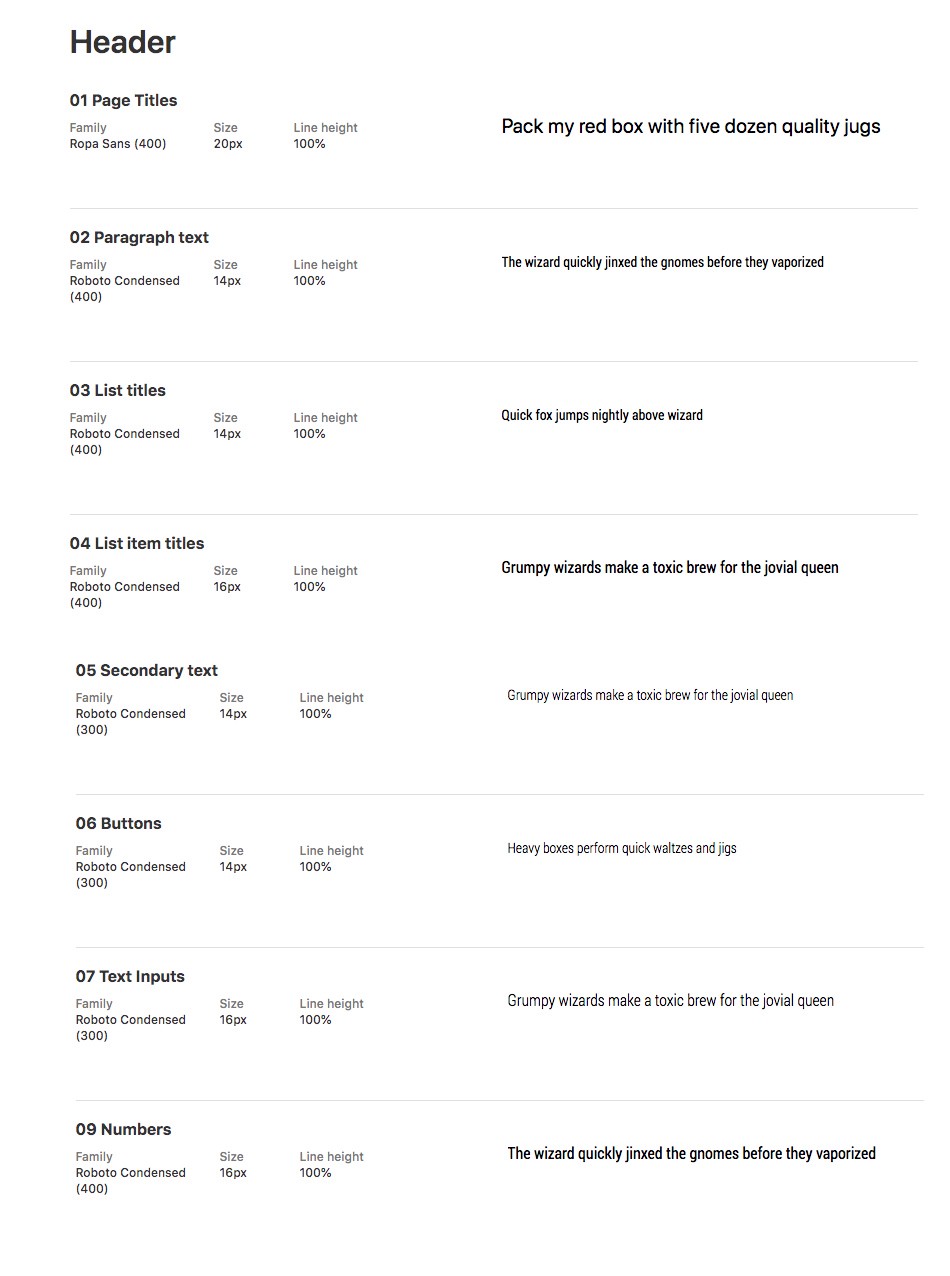
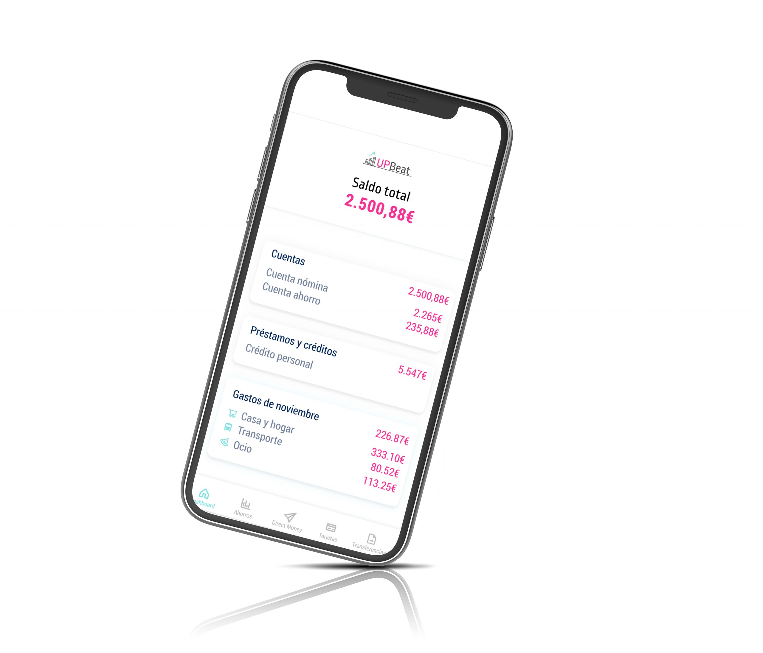
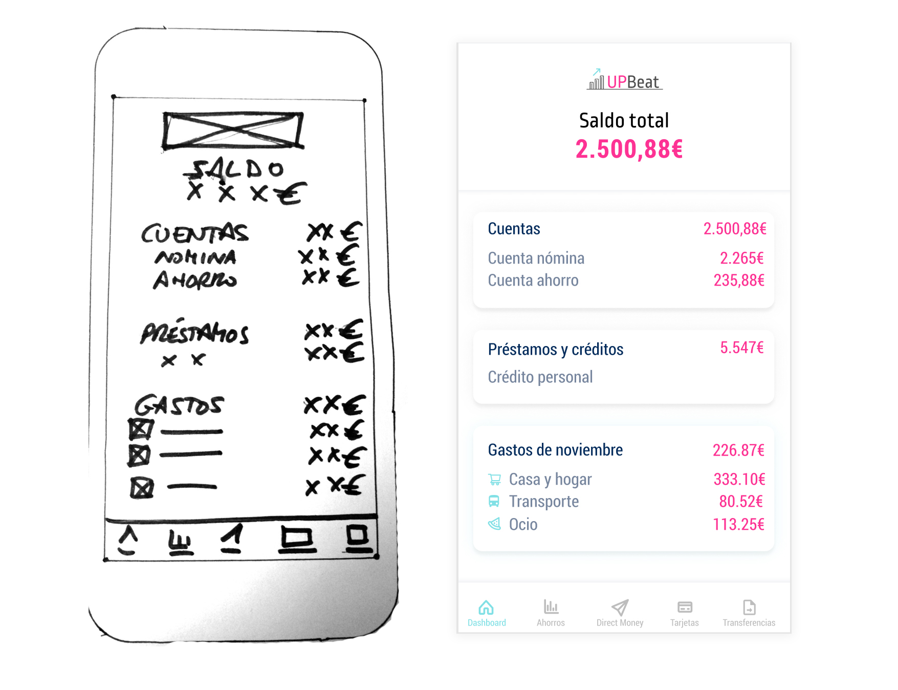
Prototyping: Dashboard for Android
The dashboard, being aimed at an audience that was well managed with technology, I decided to make it very clean, without distracting funds or artifice. The leading role was focused on the figures, at a glance you could go from one quantity to another, these were highlighted in magenta. The chosen iconography was simple but with a young and humorous touch.
The element that reported on the total balance stood out in the upper central part and three lower blocks with the information of the accounts, loans and expenses. In the lower sticky menu you could access the savings graph, card information, option to transfer money instantly and make transfers.
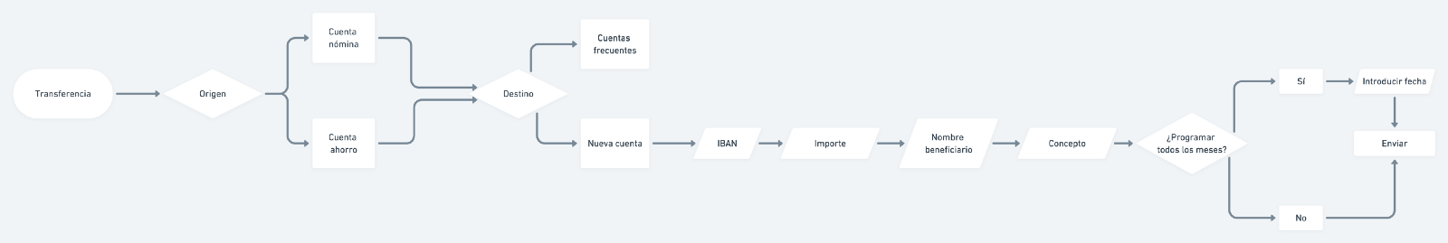
Interaction flow
In order to make the flow diagram I relied on the information collected in Benchmarking and MoSCow, through these two techniques I was able to verify that the process of making a transfer in most of the existing Apps is long and tedious for the user .
The image below shows the route that the user would follow to be able to make a transfer with the different options in which they would have to choose between types of account from which they will choose the money and if the account to which they are going to make the transfer is an account that you have used before or is a new account. It also had the possibility of programming that a periodicity be established to carry out this transfer, although this functionality did not have time to reflect it in the final prototype.