design thinking
mi pagapp
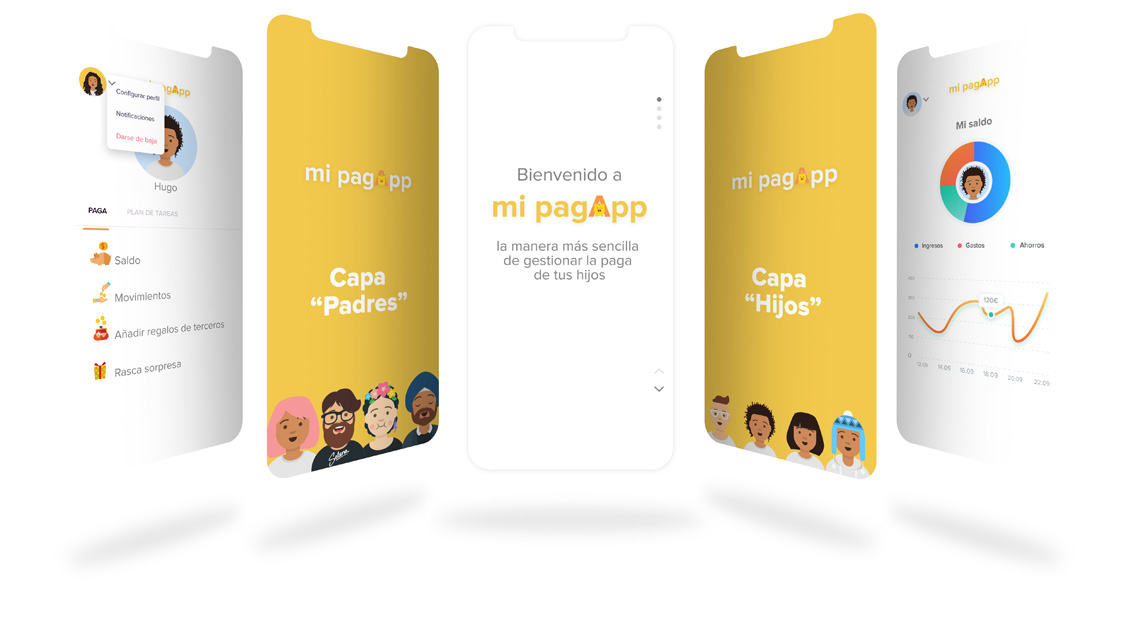
Creation and design of an app that manages the issue of the money pocket that some families decide to give to their children.
Deadline
Two weeks
Rol
Product Designer
Categories
Research
Branding
Design
Briefing
There are many studies that analyze the issue of allowance that families assign to their children and bank applications that try to address the issue, but I have not found anything that did it with the approach I had decided to apply.
Target
Families with children of the age to receive an allowance.
Values
- Easy to use and intuitive.
- Integrative, nexus between family members.
- Collaborative.
- Motivating, that encourages the fulfillment of tasks that improve the relationship in the family environment and everyone wins with it.
Goals
- Help parents better control and manage their children’s allowance.
- Make children aware of the value of money, understand that it has a value and learn to manage it.
Methodology
Design Thinking brings the user to the center, makes him the protagonist, it helped me to open my mind and learn in depth how the issue of economic allocation is resolved in families.
research: Techniques
As I had only fifteen days to execute both the research part and the visual layer, I decided to include the following techniques to support the research phase:
Research questions
Desk research
Questionnaires
Focus group
MoSCoW
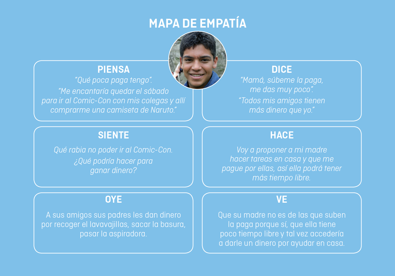
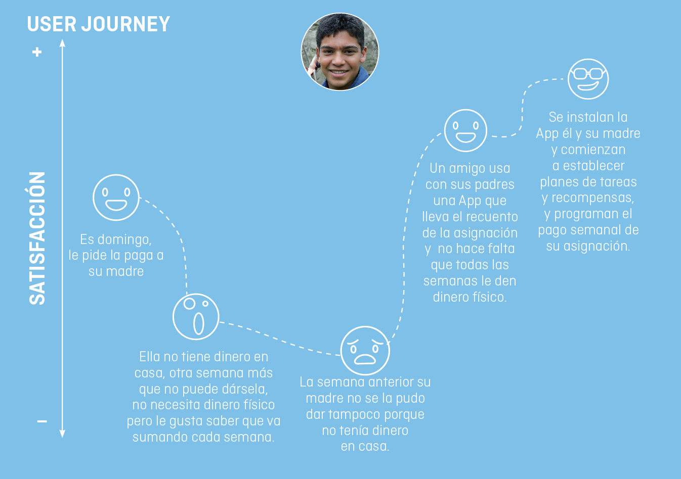
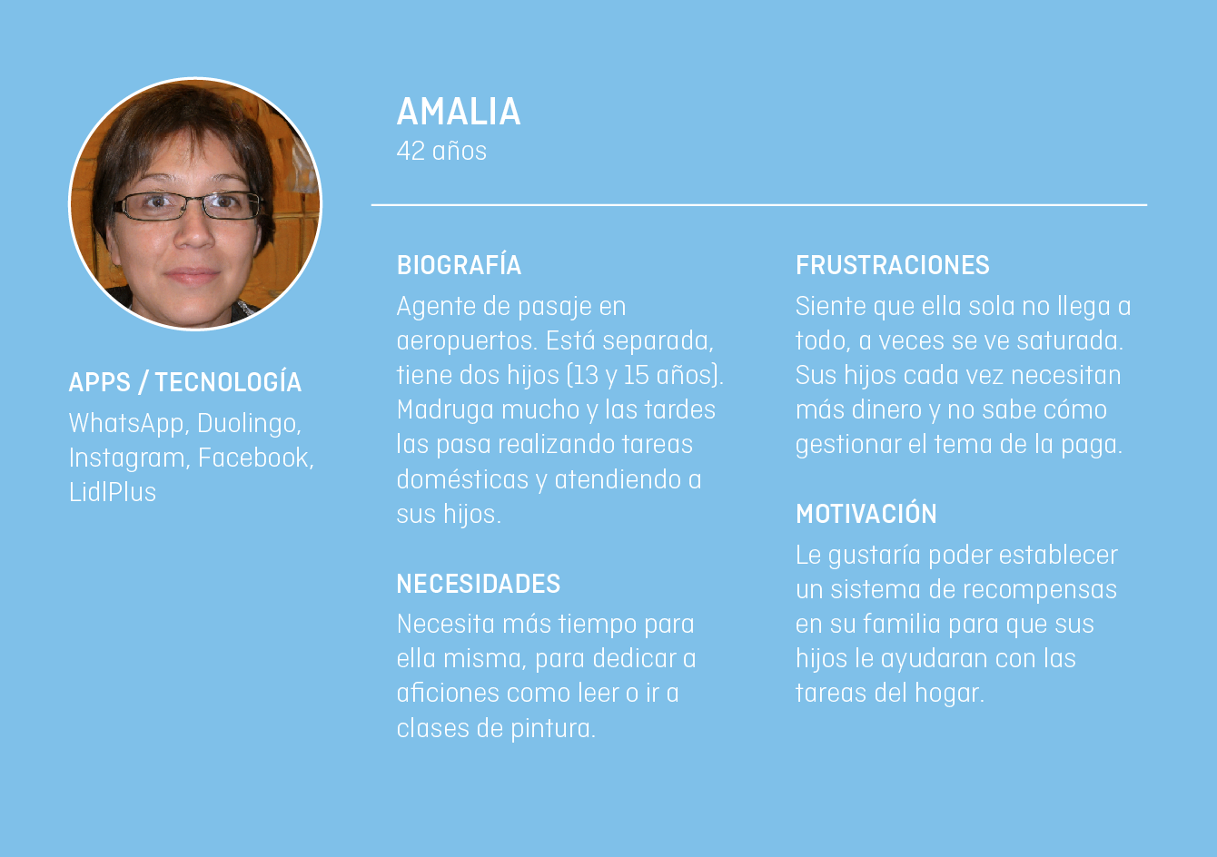
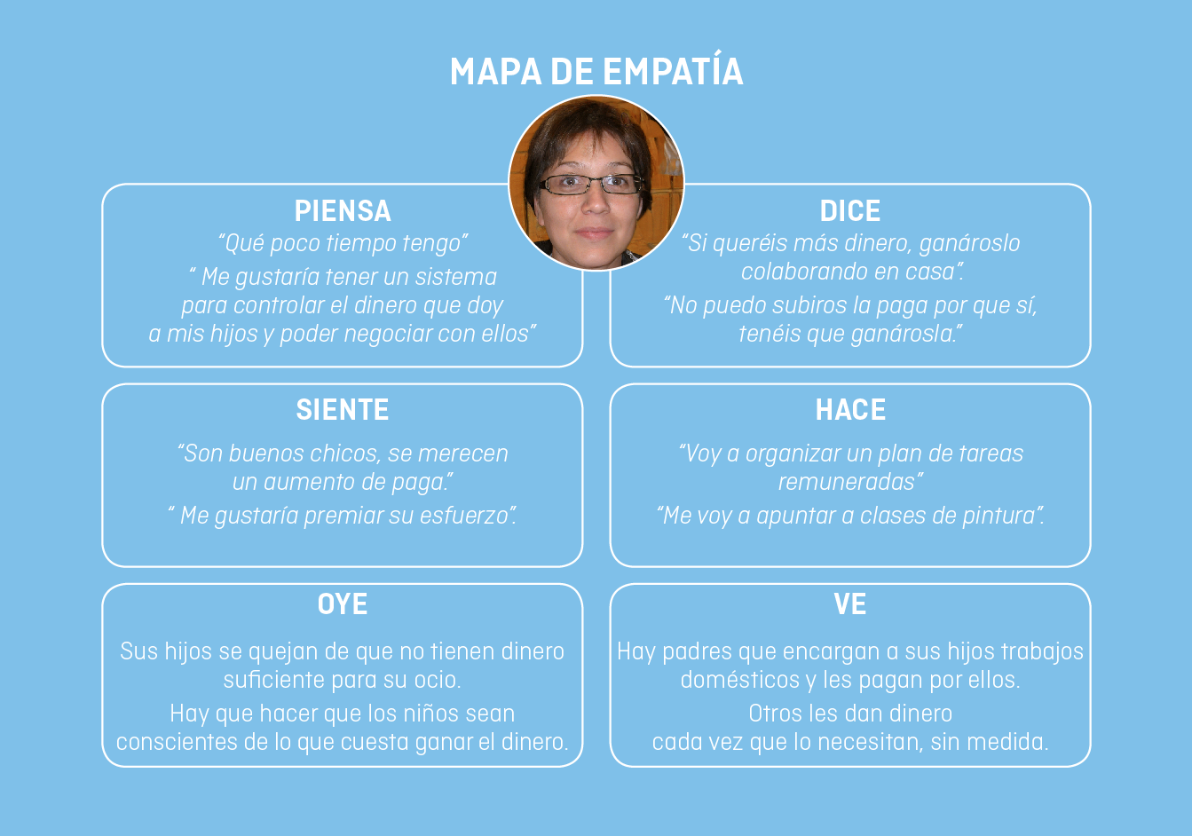
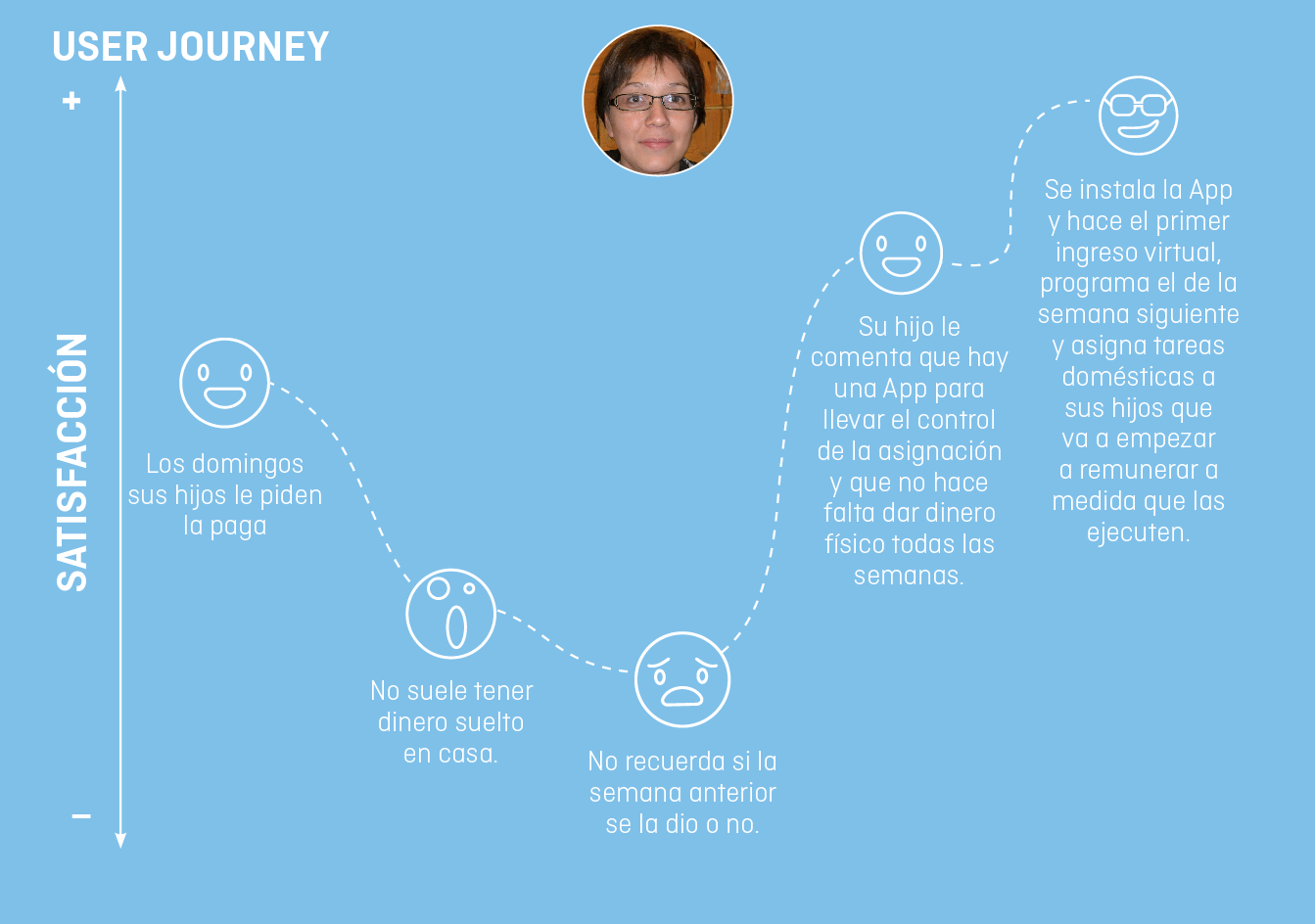
User persona, empathy maps, user journey
RESEARCH QUESTIONS
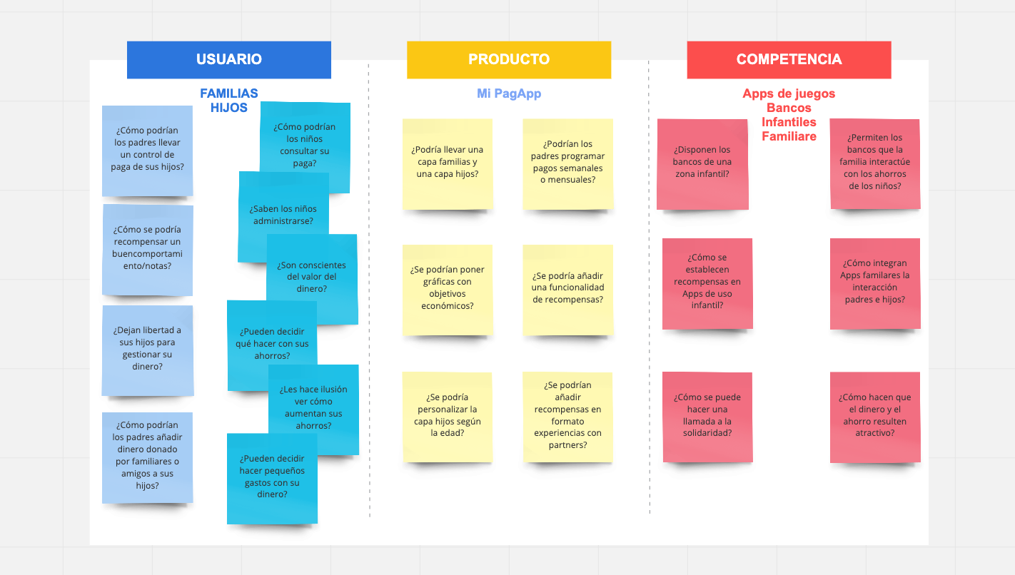
I formulated a battery of questions that covered needs from the point of view of potential users, the product and the Apps currently available on the market that dealt with savings and family finances.
DESK RESEARCH
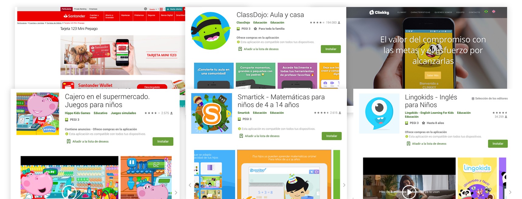
There is no App that right now covers the needs raised, even so, I focused on studying the service offered by banks to families, educational applications, savings management and finances in general.
QUESTIONNAIRES
I decided to do two different survey models, one aimed at fathers and mothers and the other at young people. It seemed very interesting to me to have both points of view, to know how parents and children saw the issue of pocket money. The research questions helped me to develop the questionnaires.
I chose the town of Arroyomolinos, Madrid, the youngest municipality in Spain, to launch the surveys. In just two days I collected 119 samples from adults and 31 from young people.
hours
adults
children
PARENT QUESTIONNAIRE
Done to parents, 48.7% had children between 4 and 11 years old and 37% had children between 12 and 18 years old.
I drew, among other conclusions, that the children used to perform support tasks at home, the parents did not usually have cash at home to pay them and that on many occasions they forgot to give them the allowance.
- 85,6% – Children who help with household chores
- 67,68% – they didn’t used to have cash at home
- 60,61% – they forgot to give them the assignment
CHILDREN QUESTIONNAIRE
Made to young people between the ages of 11 and 18. Among the data that most caught my attention were that the majority reported on their expenses, that they tend to save and that more than 60% would like to be able to use part of their money to help other people.
children
- 81,82% – He reported on his expenses
- 90,91% – save
- 63,6% – they would like to help in solidarity causes
FOCUS GROUPS
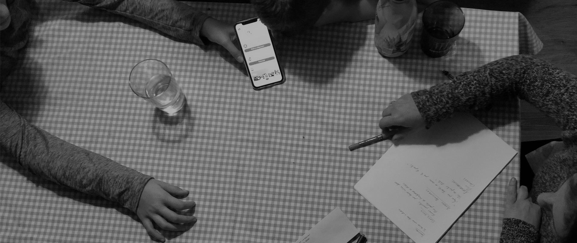
It seemed like the best way to address all the doubts that arose about the project. I organized one with three couples between the ages of 40 and 45, and another with five children between the ages of 10 and 16.
Me pareció la mejor manera de abordar todas las dudas que me surgían acerca del proyecto. Organicé uno con tres parejas con edades comprendidas entre los 40 y los 45 años, y otro con cinco niños con edades entre 10 y 16 años.

MoSCoW
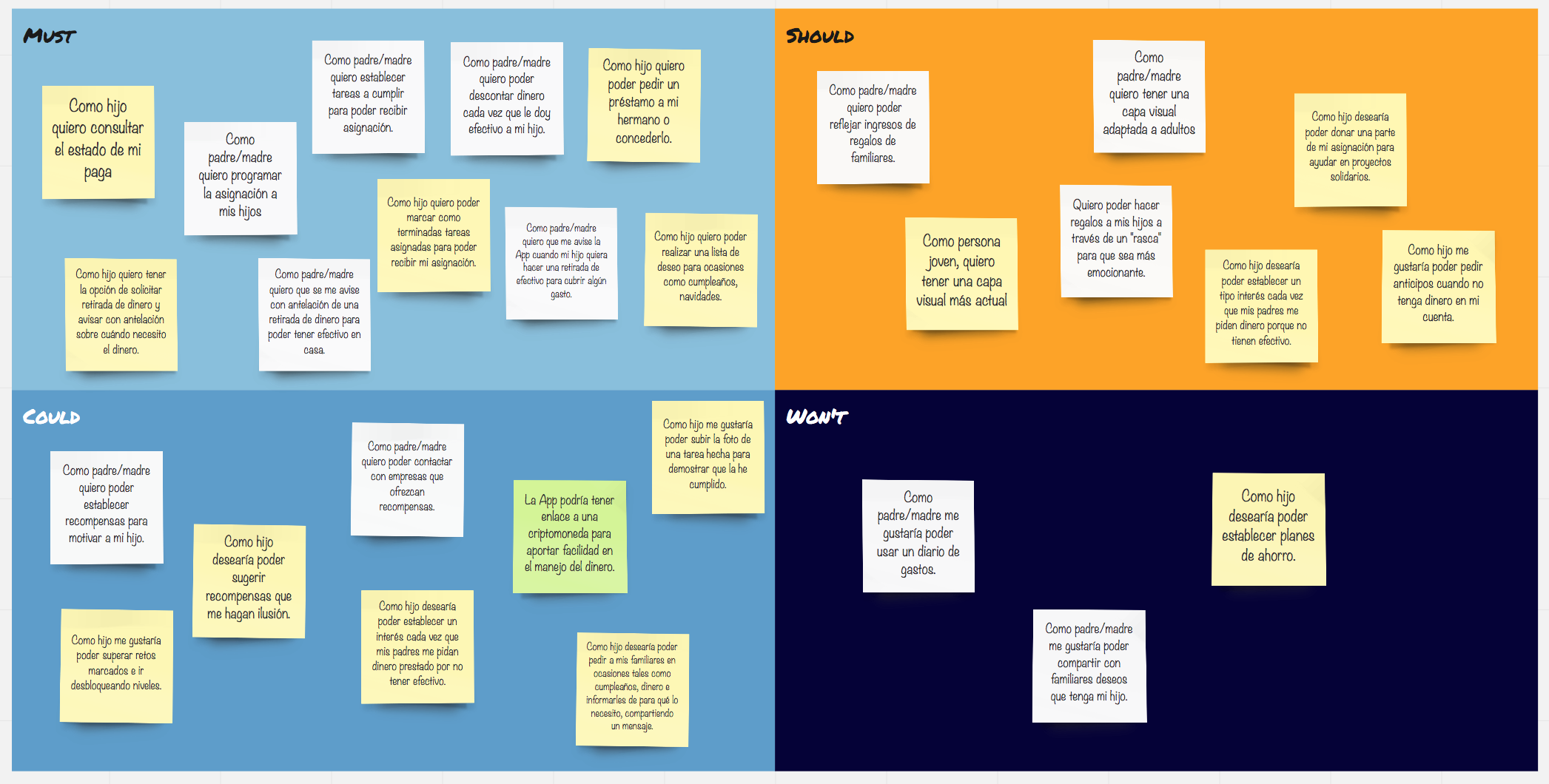
With all the information collected from the questionnaires and the focus groups, I decided to carry out a MoSCoW, with this technique the needs of the project can be fragmented by putting ourselves in the place of the user who uses the App. On this occasion I positioned the issues from the point of view the user “son” and the user “father / mother”.
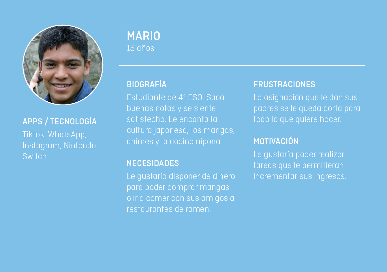
Users Persona, Empathy Maps and User Journey
Prototyping
Prototyping
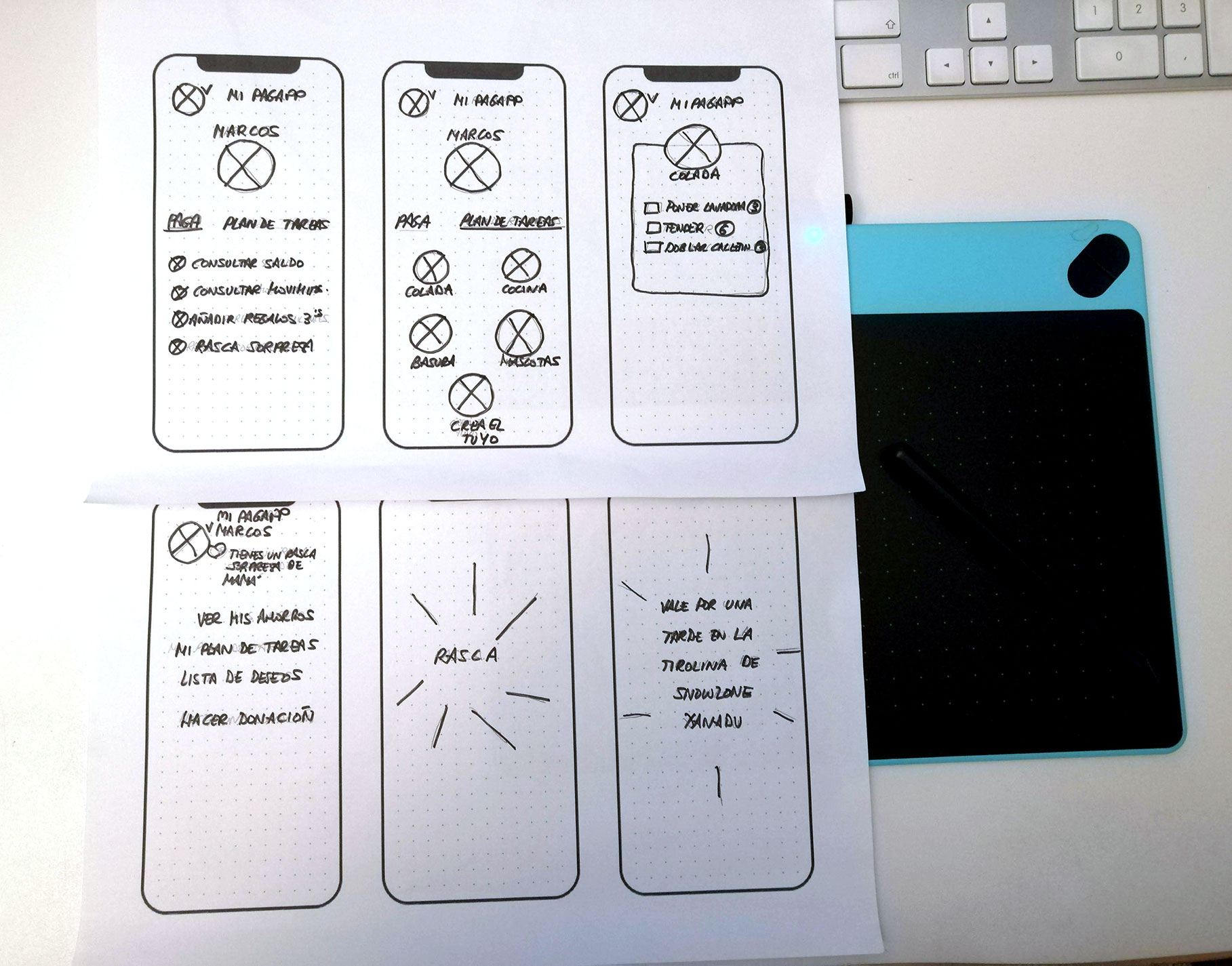
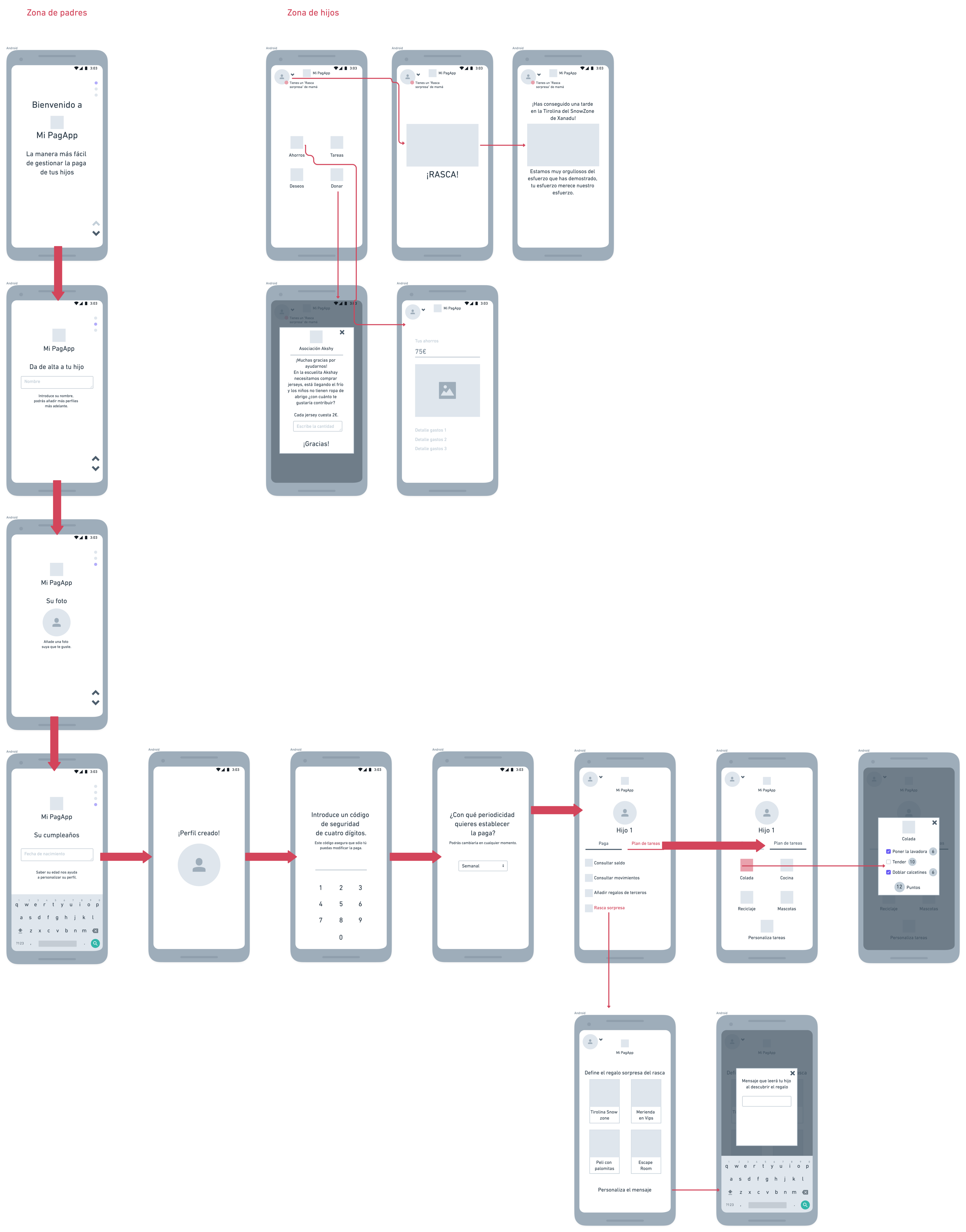
With so much information gathered, it was quite a challenge to start thinking about the screens for the prototype. I tried to synthesize the main functionalities, although there are many interesting ideas saved as futureable.
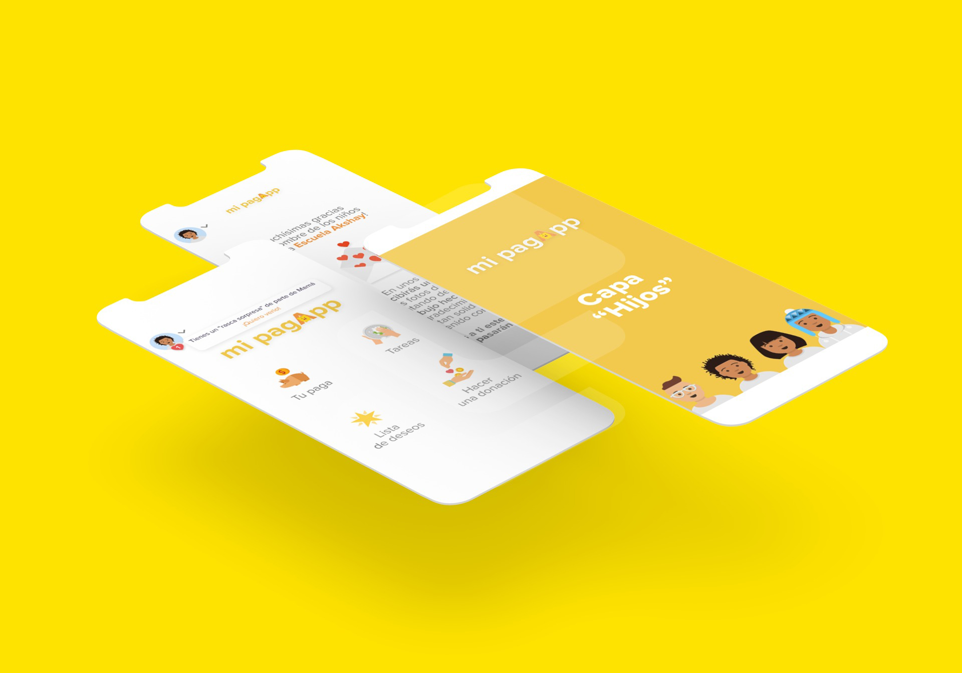
I decided to join the part of the low wireframes with the interaction flows and at the same time develop in the prototype a simulation of what the parents layer would be like and what the children layer would be like, showing the interaction that would exist when the parent or the mother will set up a surprise gift for her children.
Visual layer
Visual layer
The logo had to be simple, clean and at the same time close to the world of children and the family audience in general. I decided to incorporate as an isotype a piggy bank with the letter “A” as a house, evoking the story of the three little pigs. The oldest, the one who built his brick house and who would surely be very economical, managed to save himself and others;)
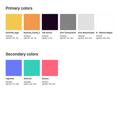
The color palette is made up of yellows and oranges as primary colors and secondary colors such as blue, green and red to display the graphs with the information regarding income, savings and expenses.
The typography is the Proxima Nova, despite having been created in 1995 it has proportions that do not go out of style and its geometric appearance makes its use harmonize the design. It is balanced and has eight different weights.

Interaction
Interaction
coming soon…
Coming soon…
This app is currently in the development and programming phase, it will shortly be available in the App Store and Google Play Store.

