ZARA WE CARE PROJECT
A project that supports sustainability and helps women in disadvantaged situations
A project that supports sustainability and helps women in disadvantaged situations
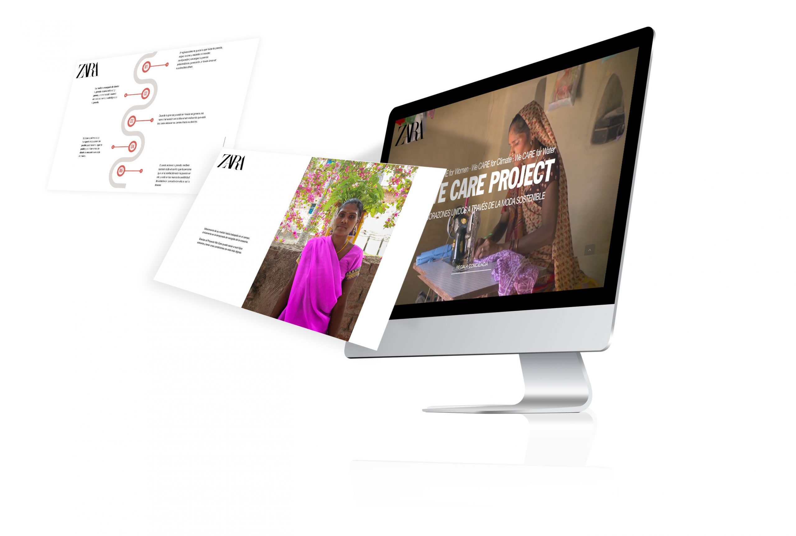
Sustainable fashion, garments made with soul by a woman in India.
Deadline
Two weeks
Team
Three people
Categories
Lean UX
KPIs
MVP
Personal Project
Briefing
Create an MVP (Landing page) that offers a sustainable product, that supports women in disadvantaged situations and that is supported by blockchain technology.
Target
- Users who no longer shop at Zara because they are aware of sustainable fashion.
- Users interested in fashion.
- Users who seek to make an ethical and conscientious gift.
Goal
- We needed people who no longer buy from Zara for ethical reasons to trust and buy from the brand again.
- Another goal is that people feel safe buying this line of clothing, since through the blockchain methodology they will be able to verify the traceability of the product.
- To draw the attention of users who continue to buy at Zara who are more aware of sustainability and also feel that by buying this product they are helping, in addition to the planet, a woman and that she can improve her living conditions.
Needs
- We must ensure trust both in the origin of the product and in the objective of helping women and we will do this through blockchain technology.
- We must make our user empathize with the stories of the women behind our product.
Methodology
Lean UX “fail fast and fail cheap”. This methodology allows creating a real product, focused on users, assuming a small risk and with low cost.
ASSUMPTIONS AND HYPOTHESES
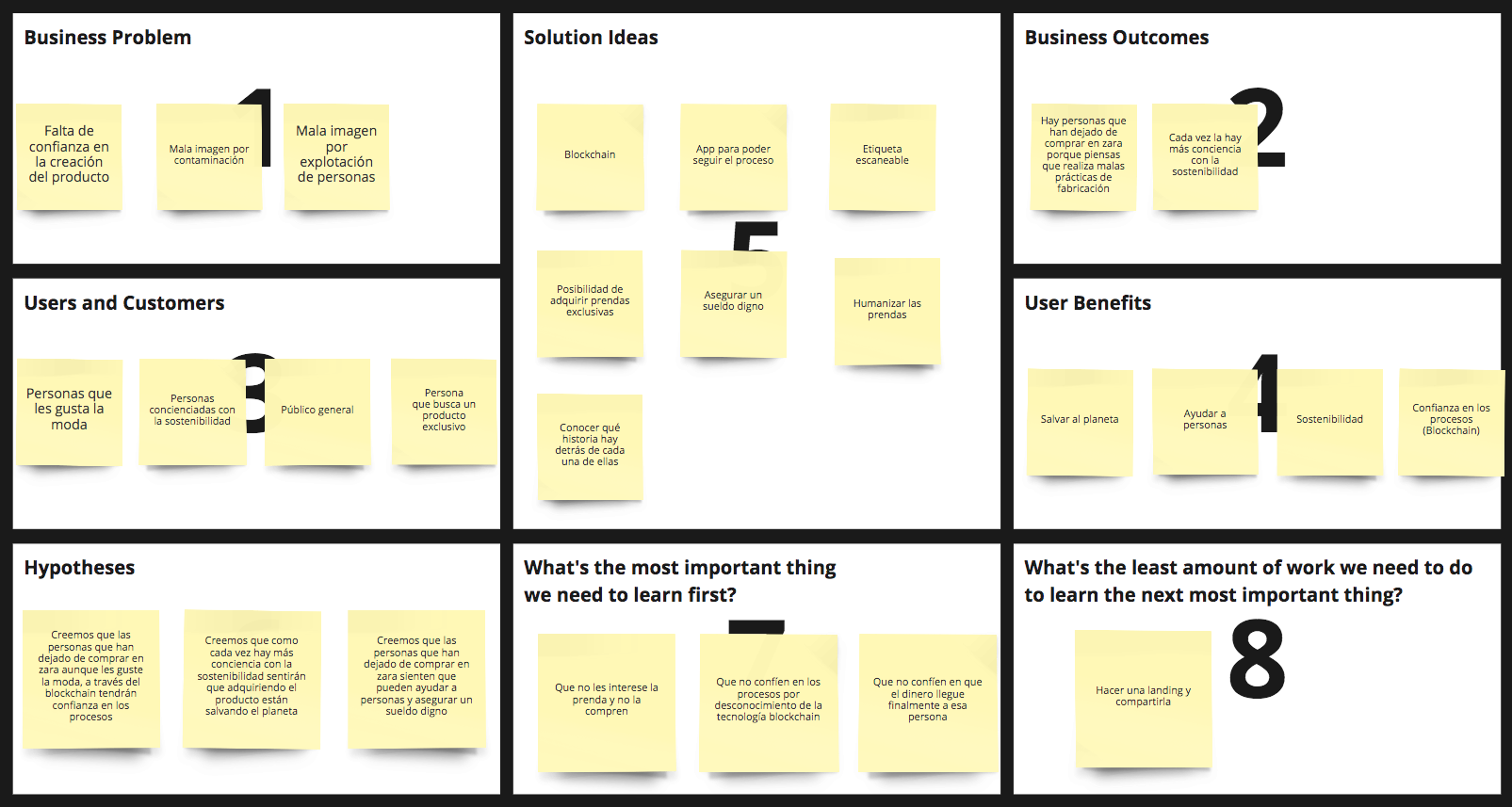
With the information from the briefing that we prepared, we brainstormed assumptions that we placed in a matrix for validation, and thus we were able to facilitate decision-making. Afterwards, we specify the most desirable, viable and feasible idea through a Lean Canvas.
LEAN CANVAS
PROTOPERSON
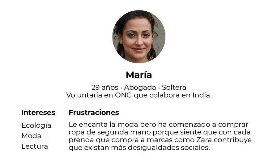
We defined a Protoperson profile to be able to identify how we could meet the needs of a former Zara customer who feels disappointed with the brand.
KPIs AND METRICS
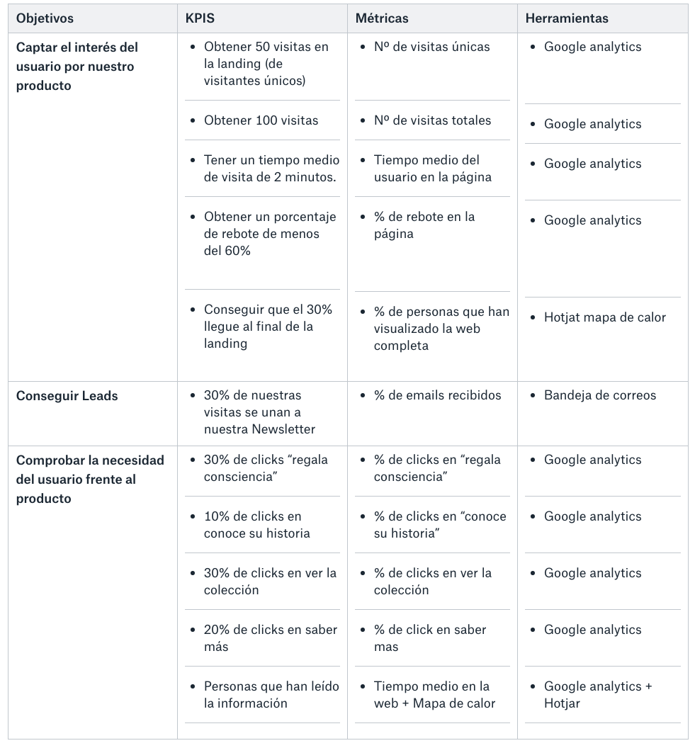
With all this information collected, we established the KPIs and metrics objectives that would allow us to know if our product would be viable or not.
INFORMATION ARCHITECTURE AND WIREFRAMES
After establishing the KPIs and metrics, we build the low-level information architecture and in turn write the copies. The copies would have a special importance in the landing, we had to reach a very varied audience but above all to get excited.
The visual layer would not have much complication because the goal was to make it look like Zara was launching this new sustainability project.

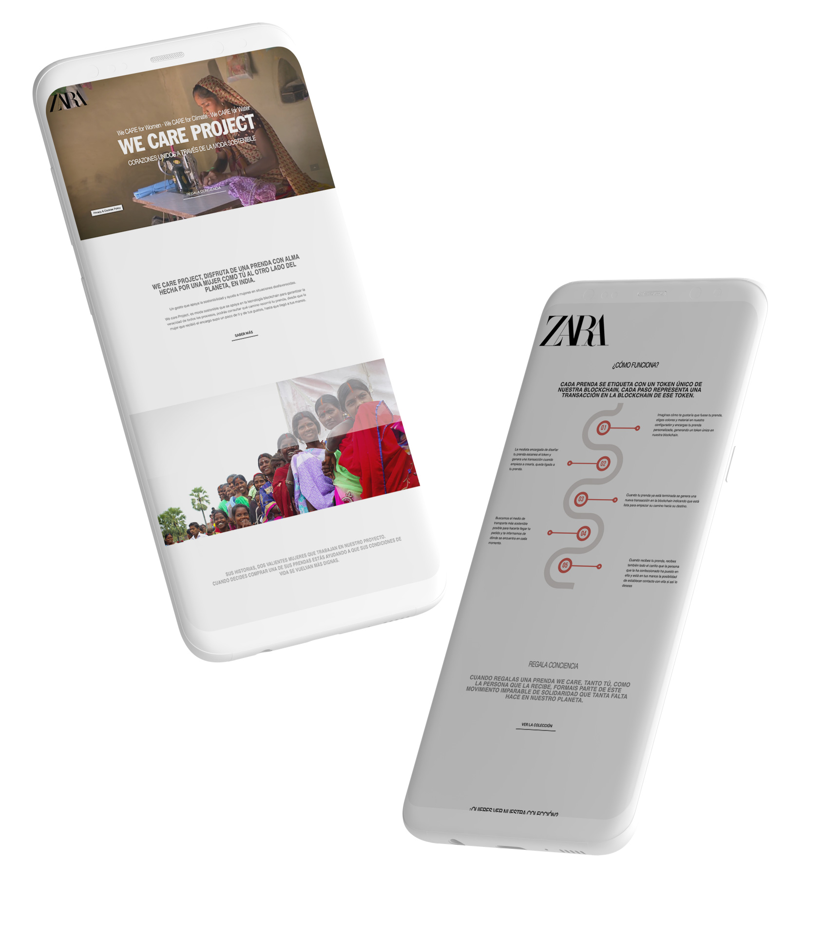
RESPONSIVE design
It was very important that the landing worked well in both its desktop and mobile versions. This was a challenge due to the need to show a video in the hero of both versions.
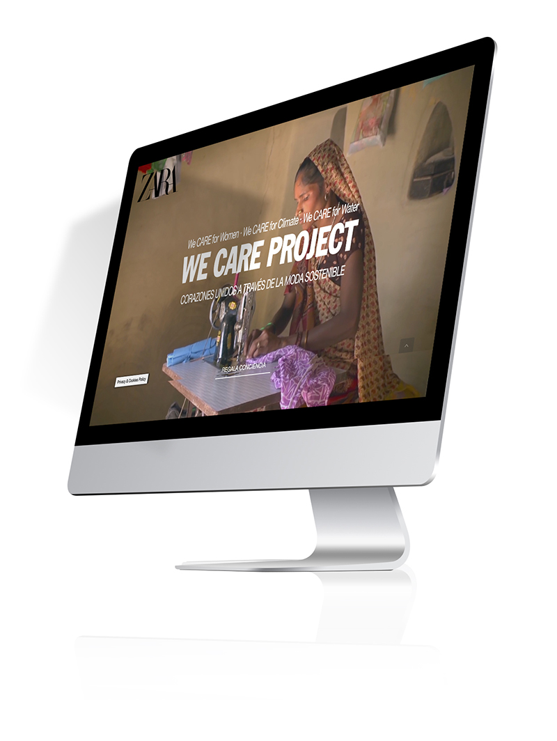
Release
Release
The day of the release arrived, with enough tension to see what happened and what credibility we had, we made our objective a reality, to evaluate if our product was viable.
We launched our MVP in Facebook groups about sustainable fashion and forums related to ecological fashion in which we were sure that we would find a part of the audience that we needed.
In a second phase, we launched it more generally in order to collect measurements from a wider audience.
The measures
The measures
And it was time to measure the reach of our MVP using Google Analytics, HotJar and Mailchimp.
Heatmaps Hotjar Desktop
Hotjar sample of the events collected from click, movement and scroll.
- Users stopped at the hero included on the web.
- Users interacted in the section gives awareness.


Heatmaps Hotjar Mobile
Hotjar sample of the events collected from click, movement and scroll.


conclusions
conclusions
The majority of users did not believe that Zara was launching a project of this type and they thought that our website was a scam. We collected comments like this one below:

We met the expectations regarding the number of visits we expected to obtain and the events scheduled to arouse the interest of users. But we were able to verify that they either did not trust us or they did not trust Zara, so we could not obtain enough leads, and that this proposal, coming from this brand, did not meet the needs of this type of customer.


